As part of our research for our documentary, Carolina and I watched another documentary by Jacob Kornbluth called “Inequality for All,” starring Robert Reich, former US secretary of labor during Bill Clinton’s period.
 |  |
The documentary—as the title states—focuses on the inequality in the US and helps us understand the causes and effects.
One of the most interesting parts of the documentary shows a visual representation of the inequality during the 1920s and 2007.
One of the most interesting parts of the documentary shows a visual representation of the inequality during the 1920s and 2007.
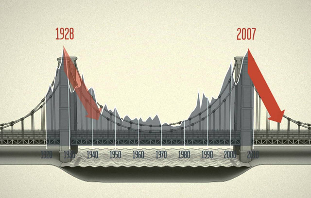
| As Reich explained in the 90-minute documentary, during the 1920s the low income taxes had caused a massive wealth gap in the United States and therefore the rich people were hoarding their money, which meant no spending and no money being 'injected' in the economy. Then, however, the presidents raised the taxes—especially to the wealthiest people—between the 1930s and 70s, which then led to a pretty strong middle class. The consequence of this was that it finally decreased the huge gap between the rich and the poor that was created in the 1920s. | Until now, we can see that income taxes are not reliable and are constantly changing. In the 1970s we can see—once again—that the income tax was cut for the wealthy people to pay and also the wage of workers had flattened. The result of this was having a huge wealth gap once more and shrinking the strong middle class that the US had at some point. |
However, what does the actual bridge represent and why is it so important?
-I n e q u a l i t y-
The first peak in the bridge represents when the inequality was really high during the 1920s. This mostly occurred because of the low taxes offered for the rich people, as mentioned before.
Then, we can see that the inequality is declining around 1928 caused by high income taxes and this is shown in the actual bridge (in the middle). And finally, at the end we can see the peak in the bridge and this represents how the inequality has risen again in 2007 (approx.) again because of the low taxes offered to the rich.
During this time, as well, there was an economic growth in the US until 2011 when productivity increased a lot but surprisingly wages kept decreasing since 1970. This is interesting because it's also occuring in Peru. There is a rising middle class who seems to been working harder in the last few years but their stagnant and going nowhere for the most part.
 RSS Feed
